Hostile architecture sits uncomfortably – quite literally
Architecture is the art of designing and building structures for the benefit of communities. So what happens when the purpose of the project is to keep people out? Shaun Soanes explores the controversial concept of hostile architecture.
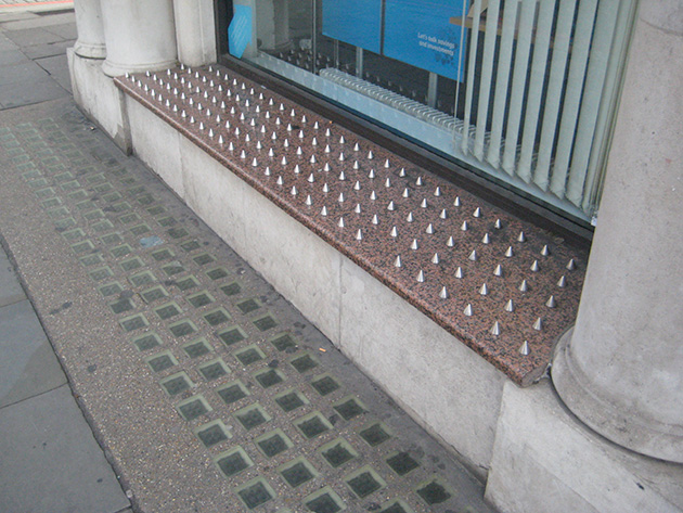
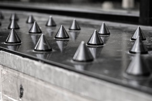
From spiked protrusions on window ledges and metal park benches with solid dividers to forests of cement bollards and bus-shelter seats that pivot forward, urban spaces are aggressively rejecting soft, human bodies.
It’s called hostile architecture – an urban design trend in the way public spaces are constructed or altered to exclude humans or hinder human use.
On first examination, this sounds alien to the basic idea of the architect’s profession – to provide homes, office spaces and social places for communities to work, live and engage with each other in.
But actually, it is becoming a significant element in the design of space – aimed at groups such as loitering teenagers, skateboarders or the homeless population.


Is it fair?
It’s understandable that hostile architecture has met with some criticism.
Some have labelled it an extreme form of “pest control”. Others say such elements are an eyesore. There are still more who claim the addition of spikes are totally out of proportion to any problem caused by people perching on a wall or in a doorway.
UK based artist Stuart Semple, founder of the “Design Crime” campaign, said: “Hostile architecture often attacks the most vulnerable people in our community, regularly the homeless.
“It sends out a very clear signal, that certain people aren’t wanted. “
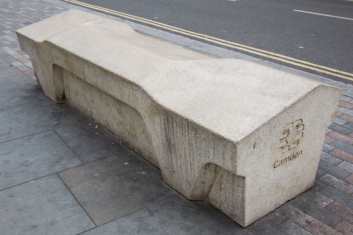
In 2009, a series of benches installed in Camden came under fire as being an example of hostile design.
The designer received the brief from Camden council to create a bench that would deter loitering, sleeping, skating and prevent drug drops.
The solution was a cast concrete bench with uncomfortable sloping surfaces.
But architect James Furzer, whose work attempts to combat hostile design, said the council had approached the problem the wrong way.
“I feel we need to design spaces that encourage good behaviour – and turn antisocial behaviour into welcoming behavior,” he said. “Ultimately, architecture isn’t the cure of homelessness.”
He has a point.
After all, discouraging homelessness but offering no practical solution is not just hostile, it’s unfair.

Making it work
Last September, the Seattle Department of Transportation (SDOT) installed 18 bike racks under the Highway 99 Viaduct in Belltown.
Their purpose was not actually to encourage people to lock up their bikes, but to prevent the occupants of a recently cleared homeless encampment from returning to the spot. News of the bike racks and their intended function broke in December and public outcry followed.
SDOT were forced back to the drawing board and move away from using bike racks for displacement purposes.
And now, instead of a fund being allocated for hostile architecture, there are plans to redirect it to housing options for those that are homeless.
London based landscape architects, The Edible Bus Stop, claim there lots of ways to avoid hostile architecture.
They worked with the local community in Brixton, South London, to develop a public space at Southwyck House.
The element of collaboration made it feel more inclusive right from the start and the design included an edible garden for the community to look after, grow and use.
Due to the estate’s murky history the community were initially sceptical about adding seating to the site, not wanting to encourage anti-social behaviour.
But the Edible Bus Stop were able to overcome this with the power of good design and fostering a sense of ownership – the space was theirs to look after.
Defensive design
Not all hostile architecture is bad.
In some cases, it successfully deters criminal behavior without resorting to crude solutions as stainless steel spikes.
Innovations currently being developed by Central St Martins include “ATM art” – ground markings aimed at increasing the privacy and security of cash machine users for example.
But the conversation about how – and why – we incorporate certain elements into our urban landscape continues, especially in design circles.
After all, it still sits uncomfortably – quite literally.
In short, if I, as an architect, designed a building where people didn’t want to stay for long because it is hostile and uncomfortable, I would not feel like I had succeeded in my job.


 The Christies


